
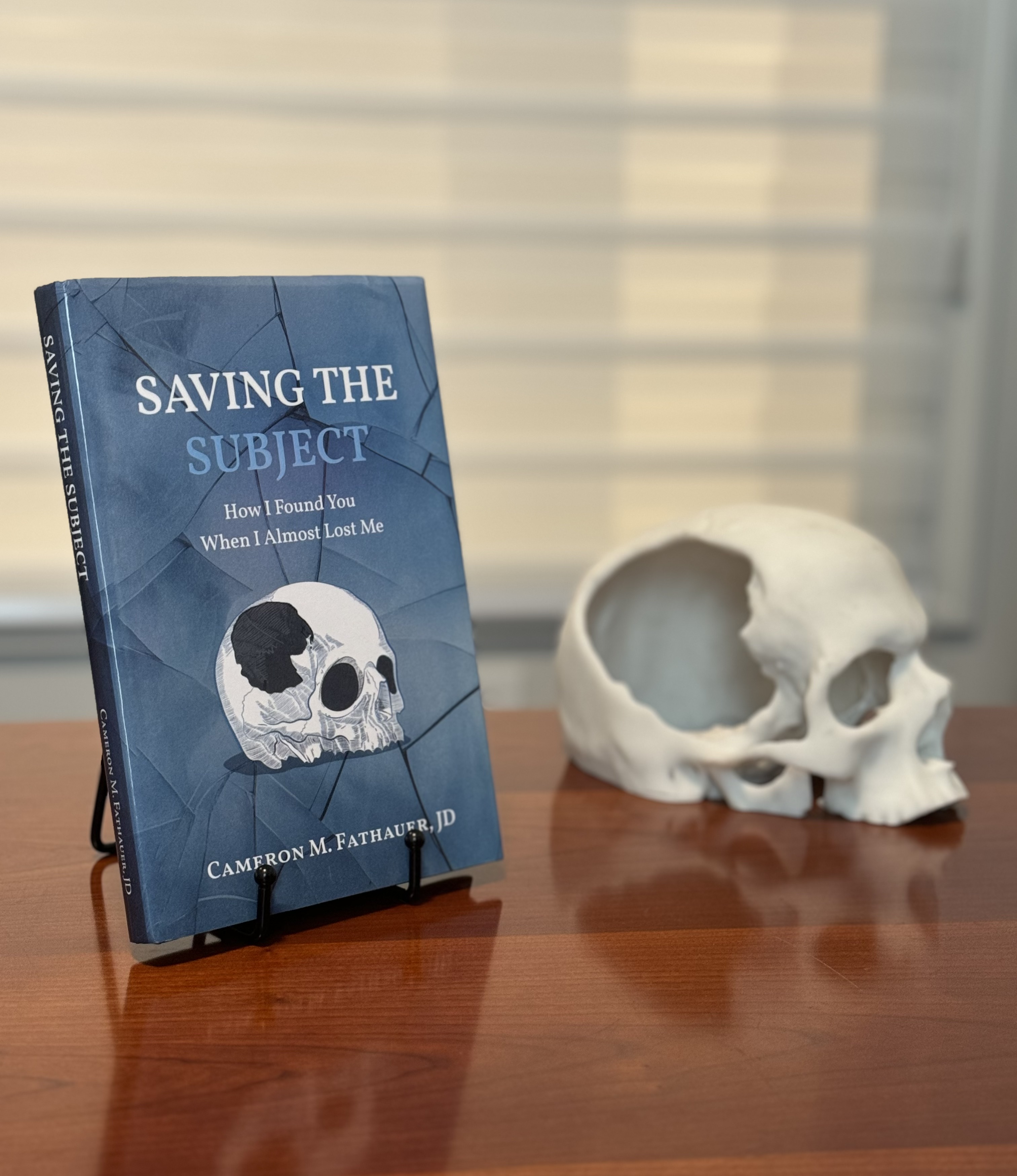
When it came time to design the cover of Saving the Subject: How I Found You When I Almost Lost Me, I knew I wanted something that not only reflected the content of the book but also visually communicated the depth of the journey I have been on. The cover is more than just an aesthetic choice; it’s a representation of the themes that run deep within the pages of this story. Here was my thought process behind it:
The Skull: A Symbol of Mortality and Vulnerability
The skull is a central image on the cover, and it carries significant meaning. In many ways, it represents the physical aspect of my traumatic brain injury—the event that shattered life as I knew it. The skull is a stark reminder of mortality, the fragility of life, and the vulnerability that we all experience at one point or another. But this skull isn’t just any skull; it’s personal. It symbolizes my own experience, the literal fractures I endured, and the healing process that followed. It serves as a daily reminder of how close I came to losing everything. But more importantly, it reminds me that I am so much more than a brain.
The Shattered Glass Effect: Brokenness and Restoration
Surrounding the skull is a shattered glass effect, which represents the brokenness that accompanied the traumatic event. I literally shattered the windshield of the Lexus that struck me. It’s a visual metaphor for the moment when everything in my life seemed to shatter, when I was left trying to piece together what had happened and who I was. But broken glass also speaks to the process of reconstruction. The cracks may be visible, but they add depth and character—just as the experiences of suffering and healing have added depth to my life.
The Color Scheme: Calm Amid Chaos
The background is a deep blue, a color chosen for its associations with calm, reflection, and introspection. Blue is often connected to themes of trust, depth, and wisdom—qualities that I’ve had to embrace throughout this journey. The blue tones contrast with the intensity of the skull and the shattered glass, providing a balance between chaos and peace. This contrast reflects the content of the book itself: the story of navigating trauma and finding purpose in the midst of it.
The Title and Typography: Reclaiming Identity
The title Saving the Subject is central to the cover and the book’s message. The word “subject” speaks to both the concept of identity and the person at the heart of the story—me. It’s about reclaiming identity after it appears to have been shattered. The title suggests that the book is about more than just survival; it’s about rediscovering and saving who I am despite what I lost.
The subheading, How I Found You When I Almost Lost Me, speaks to the philosophical and spiritual insight I gained from the accident. It’s about finding the human “subject” in a world full of objects—about discovering what it means to truly be somebody in the midst of a world that wants you to be everything but. Hence, the word “SUBJECT” on the cover is a light blue color and somewhat difficult to read, reflecting the existential difficulty of finding the subject in a world like ours.
What the Cover Design Says About the Book
Ultimately, the cover of Saving the Subject is designed to convey the central themes of the book: trauma, identity, and faith. The skull and shattered glass immediately signal to readers that this is a story of brokenness and healing. But the calm blue tones and the title hint that this isn’t just a recounting of hardship—it’s an implicit reflection on growth, a detailed evaluation of the human condition, and an honest assessment of our subjective situation.
I hope the book cover gives you a glimpse into the deeper layers of Saving the Subject, and I look forward to sharing the full story with you soon.
Leave a Reply